Below is the first slide of the group digipak that nicole created, she included an image of our artist Mike Smith, and edited it in photoshop to create a sketched effect too it. The writing and font that is used is clear so that it stands out and is noticable, the colour white helps this as, the background is dark so the white stands out against it. There is a shadow afect which is used which creates an illusion of the artist and also attracts attention towards it. It is clear here that the colours all match together and that there is a clear colour scheme.

Below is another slide to the digipak which is the thankyou page. This is where the artist thanks who he wants to for him making his album, it acts as an appreciation. Thankyou pages, are known for attracting the audience as it feels as though they are being recognised by him. The colour scheme here follows through the same as the front cover of the digipak, so that it looks consitstent. However here the purple and the black shadow effect have been switched round.

Below is one of the pages of the digipak which most include a couple of images of the artist, here i decided to add a basic one of the artist. They are usually used to gain interest from the audience and to give them something too look at. The image is very basic and is looking straight into the camera, which can help the audience gain a relationship with the artist. The same colour scheme is used so that the digipak looks in place and doesnt look unconsistent. Another image of the artist is used in the background but is acted as a shadow effect.

Below is the part of the digpak where the CD will be placed, the circle helps show this and then the rest of the background is the back of the case. Nicole continued to use the colour scheme here and also use the same font type and colour for the artists name with a slight purple outline. A white glow is used on the centre circle which will be shown to create emphasis on the CD.

Below is another part of the digipak where pictures are used to entertain and excite the audience, again two images are used here, one of the images is of the artist looking as if he is praying, this could be seen as the artist appreciating what he has achieved. The colour scheme is still consisent here, in the background there are lyrisc to his song which is the single 'Stay Awake' over this the artists name, which has a glow effect used on it. This helps gain recognition for the artist, as it has two images of him, the artists name and also the artists lyrics. It helps give an idea fo the artists lifestyle.

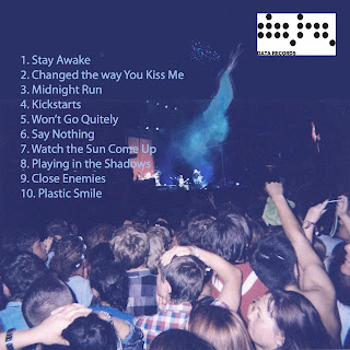
Below is the last page of the digipak, this matches the conventions of dance well and fits in perfectly, the background is an image of people watching a concert, to give off the dance vibe. It includes all of the artists songs that are in the album, so that the audience know what they are buying in to. The background was edited in photoshop. It also includes the artists record label they are included so that the record label are also recognised.
You have made a start in explaining why you and your group decided on selecting Nicole's deigns for the digipak. You have considered some of the strengths, but you also need to include the constructive elements too.
ReplyDeleteWithin this post you also need to include your design and Carrie's design to show further evidence of group planning and discussions.