Before creating my music video I had to decide what editing styles I would be using in my music video as its what makes the video look professional, however I had to really think about where I would include them as it would affect how the artist is being represented and it could even effect the narrative and concept of the video. Choosing whether I would use slow paced editing or fast paced was a hard decision as it can create and portray different things. I decided to use slow paced editing for the part in the music video where the girl is laying on the floor she gets up turns around looks at the camera and starts laughing. I used fast paced editing when the girl goes to get in the car and shuts the door it shuts three times to the beat of the song. Other than this the type of editing styles I used are consistent throughout my music video.
I used a fast forward effect in the party scene when everyone is jumping about this helps the party be seen as being out of control and something that happens so quickly to be so damaging, so this is when the drugs are being taken and the underage drinking is taking place. I used the rewind effect as it helps the music video pick up pace and can excite the audience, as I mentioned earlier the re wind effect was used when the girl goes to get in the artists car and then rewinds to her going back to the house from where she came from, this creates the illusion of a flashback as then party scenes are showed there onwards. Overall editing styles are very important as they are what make your music video, however they have to be strongly considered as they can represent the wrong things, or represent something that wasn't intentional and doesn't relate to the target audience.
Thursday, 7 March 2013

storyboards
Below are images of my storyboards for my music video, in preparation I had to create story boards so that when it came to filming, i knew exactly what had to be in each shot and for how long. Story boards are essential when filming whether it be for a music video or not, this is because it sets you off for when you start to film and can help you for a starting point. They help you to be organized and is something to follow for filming. When filming my music video i followed the storyboards to an extent however there were some shots that were added in that weren't on the storyboard originally.


Wednesday, 6 March 2013
group magazine advert
When deciding which magazine advert we would be choosing as a group, I looked at them all and then we all decided that we would be choosing Carries magazine advert. We decided to choose Carries advert as it is the most conventonal to the genre of our music video which is dance.
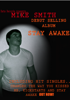
Above is the chosen magazine advert to represent our artist. Carries advert had a black background, with orange writing stating the artists album, and the information on the hit singles. The artists name is written in a dark orange/ red colour, all of these colours connote desire, passion and determination, this is the way that we wanted the artist to be portrayed.
The artists image is in black and white, which can creates a sentimental effect and creates a soft image for the artist, which is what we are going for. He is put in a positive light as in the music video he doesnt conform to the underage drinking and drug taking. Also by using a black and white image and having the image shadowed to give the background a black colour helps the rest of the writing to stand out.
Bold is used on the writing 'out now' to create emphasis on it so that the audience recognise that the album is out now and ready to buy. Written in red is the record labels name, its written in the same colour as the artists name which shows the importance of the record label as its put in the same category as the artist.

Above is the chosen magazine advert to represent our artist. Carries advert had a black background, with orange writing stating the artists album, and the information on the hit singles. The artists name is written in a dark orange/ red colour, all of these colours connote desire, passion and determination, this is the way that we wanted the artist to be portrayed.
The artists image is in black and white, which can creates a sentimental effect and creates a soft image for the artist, which is what we are going for. He is put in a positive light as in the music video he doesnt conform to the underage drinking and drug taking. Also by using a black and white image and having the image shadowed to give the background a black colour helps the rest of the writing to stand out.
Bold is used on the writing 'out now' to create emphasis on it so that the audience recognise that the album is out now and ready to buy. Written in red is the record labels name, its written in the same colour as the artists name which shows the importance of the record label as its put in the same category as the artist.
Group Digipak Analysis
Below is the digipak that as a group we decided to choose that would represent our artist.
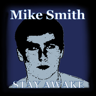
Below is the first slide of the group digipak that nicole created, she included an image of our artist Mike Smith, and edited it in photoshop to create a sketched effect too it. The writing and font that is used is clear so that it stands out and is noticable, the colour white helps this as, the background is dark so the white stands out against it. There is a shadow afect which is used which creates an illusion of the artist and also attracts attention towards it. It is clear here that the colours all match together and that there is a clear colour scheme.
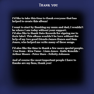
Below is another slide to the digipak which is the thankyou page. This is where the artist thanks who he wants to for him making his album, it acts as an appreciation. Thankyou pages, are known for attracting the audience as it feels as though they are being recognised by him. The colour scheme here follows through the same as the front cover of the digipak, so that it looks consitstent. However here the purple and the black shadow effect have been switched round.
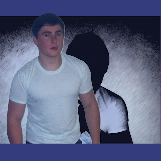
Below is one of the pages of the digipak which most include a couple of images of the artist, here i decided to add a basic one of the artist. They are usually used to gain interest from the audience and to give them something too look at. The image is very basic and is looking straight into the camera, which can help the audience gain a relationship with the artist. The same colour scheme is used so that the digipak looks in place and doesnt look unconsistent. Another image of the artist is used in the background but is acted as a shadow effect.
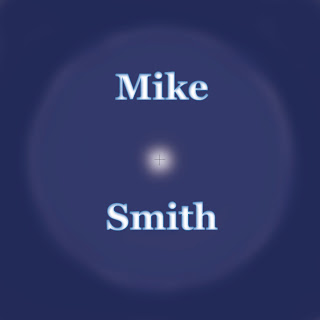
Below is the part of the digpak where the CD will be placed, the circle helps show this and then the rest of the background is the back of the case. Nicole continued to use the colour scheme here and also use the same font type and colour for the artists name with a slight purple outline. A white glow is used on the centre circle which will be shown to create emphasis on the CD.
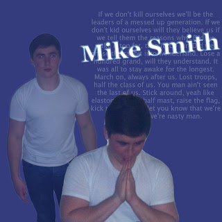
Below is another part of the digipak where pictures are used to entertain and excite the audience, again two images are used here, one of the images is of the artist looking as if he is praying, this could be seen as the artist appreciating what he has achieved. The colour scheme is still consisent here, in the background there are lyrisc to his song which is the single 'Stay Awake' over this the artists name, which has a glow effect used on it. This helps gain recognition for the artist, as it has two images of him, the artists name and also the artists lyrics. It helps give an idea fo the artists lifestyle.
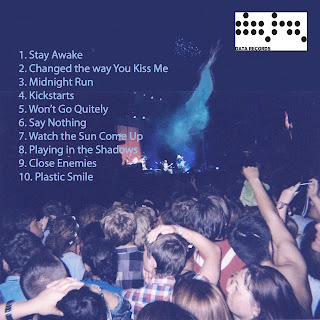
Below is the last page of the digipak, this matches the conventions of dance well and fits in perfectly, the background is an image of people watching a concert, to give off the dance vibe. It includes all of the artists songs that are in the album, so that the audience know what they are buying in to. The background was edited in photoshop. It also includes the artists record label they are included so that the record label are also recognised.
Below is the first slide of the group digipak that nicole created, she included an image of our artist Mike Smith, and edited it in photoshop to create a sketched effect too it. The writing and font that is used is clear so that it stands out and is noticable, the colour white helps this as, the background is dark so the white stands out against it. There is a shadow afect which is used which creates an illusion of the artist and also attracts attention towards it. It is clear here that the colours all match together and that there is a clear colour scheme.
Below is another slide to the digipak which is the thankyou page. This is where the artist thanks who he wants to for him making his album, it acts as an appreciation. Thankyou pages, are known for attracting the audience as it feels as though they are being recognised by him. The colour scheme here follows through the same as the front cover of the digipak, so that it looks consitstent. However here the purple and the black shadow effect have been switched round.
Below is one of the pages of the digipak which most include a couple of images of the artist, here i decided to add a basic one of the artist. They are usually used to gain interest from the audience and to give them something too look at. The image is very basic and is looking straight into the camera, which can help the audience gain a relationship with the artist. The same colour scheme is used so that the digipak looks in place and doesnt look unconsistent. Another image of the artist is used in the background but is acted as a shadow effect.
Below is the part of the digpak where the CD will be placed, the circle helps show this and then the rest of the background is the back of the case. Nicole continued to use the colour scheme here and also use the same font type and colour for the artists name with a slight purple outline. A white glow is used on the centre circle which will be shown to create emphasis on the CD.
Below is another part of the digipak where pictures are used to entertain and excite the audience, again two images are used here, one of the images is of the artist looking as if he is praying, this could be seen as the artist appreciating what he has achieved. The colour scheme is still consisent here, in the background there are lyrisc to his song which is the single 'Stay Awake' over this the artists name, which has a glow effect used on it. This helps gain recognition for the artist, as it has two images of him, the artists name and also the artists lyrics. It helps give an idea fo the artists lifestyle.
Below is the last page of the digipak, this matches the conventions of dance well and fits in perfectly, the background is an image of people watching a concert, to give off the dance vibe. It includes all of the artists songs that are in the album, so that the audience know what they are buying in to. The background was edited in photoshop. It also includes the artists record label they are included so that the record label are also recognised.
Thursday, 14 February 2013


Saturday, 8 December 2012
Film schedule
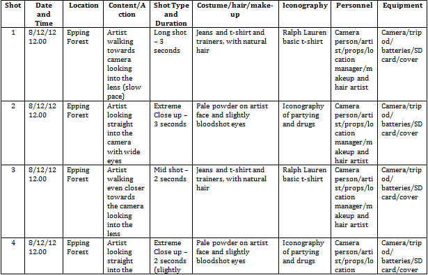

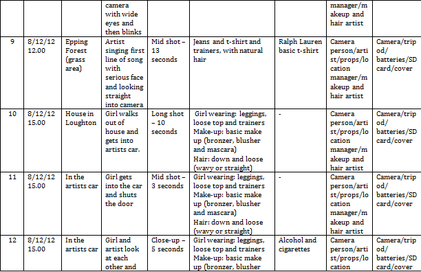
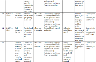


It was very important that we created a film schedule, so that we can plan when we can film and we know exactly what we need for each scene, it helps us become organised as a group. After we have completed a section of filming we can then tick that particular part off leaving us with the rest and we can then plan forward with the time that we have left. However when we start to film, changes may be made to the film schedule, someone may not be able to make filming for a reason and the weather may play a part and force us to change the date or even the location.
Risk assessment

Photoshoot
It was essential that we carried out a photoshoot as we needed a variety of different photographs to add in to our digipak and advert, at all different angles and poses. Below are the images we took in our photoshoot:
The image below is the image I would use for part of the digipak, I would crop it from his head to where his t shirt ends.


 The image above is the image I would use for a magazine advert as he is in a simple pose and looking serious.

 Both of these images I would use in a magazine advert as well.


The image below is the image I would use for part of the digipak, I would crop it from his head to where his t shirt ends.


Choosing the magazine advert

First of all I will be analysing Carries Magazine adverts. Above is the first magazine advert that Carrie made, before adding the images into photoshop, I know that she edited the pictures before hand to brush them up a bit. I like the background as it connotes the idea of a rave with the strobe lights and the stars, it could also convey the idea of night time and partying through it. It is essential and good that Carrie added in the record companys name and logo for promotional reasons. Carrie added in a large picture of the artist which I think is a very good idea as it attracts the audience not only this but it makes the audience remember what he looks like for future references. Below the image she added in the artists name used in green, white, red and blue all of these colours are perfect for a dance genre, it stands out on the poster which is important as people need to remember it and as the poster is about him, it shows that. I think that the font of the name creates the idea of being in a club the strobe lights, this is done through the glow tool that I can see Carrie has used here. Below the artists name Carrie has written all of the information down included the single name which is at the top of the information but written in a different font and more spaced out which makes it stand out, so the audience can tell thats the single being promoted. Overall I think this design is really good for a dance magazine advert it reaches the target audience well.
Below is Carries second magazine advert, I can tell that she has gone for a completley different approach and design in all. I can see that the picture has been edited into black and white and a shadow has been used to creep up on the artist. The colour scheme has changed to the colours red and orange have been used which are both quite fiery colours, which could connote the artists determination and motivation to achieve. Carrie has included the same information on this second advert, but has improved massivley. Overall I prefer Carries second advert, although her first one was good I much prefer this one its simple and effective.


magazine adverts reflection
I created two magazine adverts for our artist 'Mike Smith'. Below is the first one I created. Specifically in this post I will be analysing two of my magazine adverts I created for our artist, using Photoshop. I used my own images throughout, and applied test where necessary to keep it looking professional.

The above print screen is of the first magazine advert in which I created in Adobe Photoshop, I was new to this software so I had to play around with it in order for me to get the hang of it. I first of all started off by thinking of a colour scheme I decided to go simple with red and black, to give off a serious dance vibe to match the genre. I started off by adding a plain black background, I decided to do this so I had more to work with. I then made the top banner red and type in black text over the top 'DATA RECORD PRESENTS' I placed this at the top over the red so that it stands out. I also added to white striped either side for presentation and to keep a house style going throughout. To the bottom left of the page I wrote in white writing 'INCLUDES NO 1SINGLE STAY AWAKE and upcoming singles' I purposly wrote it in white so that it stands out and used caps lock where it was necessary. The bottom right hand side of the page is where I added in a small image of the front of the digipak I made and above in white writing 'OUT NOW'. I then had a blank space in the middle which I left purposly left for the image of the artist which we took in our photoshoot, I then added 'MIKE SMITH' in red over the top in the largest font so that his name stands out the most so the audience remember it. I added the white lines again to keep a pattern, on the outside of the artist I added a glow using the glow tool and shadowing tool to make the image stand out too.


The above print screen is of the first magazine advert in which I created in Adobe Photoshop, I was new to this software so I had to play around with it in order for me to get the hang of it. I first of all started off by thinking of a colour scheme I decided to go simple with red and black, to give off a serious dance vibe to match the genre. I started off by adding a plain black background, I decided to do this so I had more to work with. I then made the top banner red and type in black text over the top 'DATA RECORD PRESENTS' I placed this at the top over the red so that it stands out. I also added to white striped either side for presentation and to keep a house style going throughout. To the bottom left of the page I wrote in white writing 'INCLUDES NO 1SINGLE STAY AWAKE and upcoming singles' I purposly wrote it in white so that it stands out and used caps lock where it was necessary. The bottom right hand side of the page is where I added in a small image of the front of the digipak I made and above in white writing 'OUT NOW'. I then had a blank space in the middle which I left purposly left for the image of the artist which we took in our photoshoot, I then added 'MIKE SMITH' in red over the top in the largest font so that his name stands out the most so the audience remember it. I added the white lines again to keep a pattern, on the outside of the artist I added a glow using the glow tool and shadowing tool to make the image stand out too.

Above is the second magazine advert I created in photoshop. I felt more confident when creating the second advert as I had got used to what tools to use and how to work the software as a whole. I started off completely different this time and went for a different layout, however I kept the same colour scheme. I started off this time with the image, I made the image the background and edited the picture into black and white to connote the idea of day and night which represents the idea of partying through the day and night which associates itself with the dance genre. I then created the black strip down the right hand side of the page and put it in black and created text in red capitals and bold 'MIKE SMITH' the artists name, this stands out of the whole page so that the artist is remembered. I then decided to add in the little bits I added in black text near to the top 'DATA RECORDS PRESENTS' 'including NO 1 SINGLE' and then 'STAY AWAKE' I made into a bigger font and red, so that it really does stand out especially against the black and white. Finishing off this is my favourite advert I made out of the two, I feel that I played around more with the tools, and it looks more professional, I also believe that its simple and relates to the target audience and the genre of dance.
History of music videos
A music video is described as a short clip that has music in the background, usually the video is there to describe what is going on in relation to the song. However music videos have changed over the years, they are now used to sell songs and make money. Music videos started to come about in the 1980's. One of the most early music videos was from a woman called Bessie Smith 'St Louise Blues', it was made in 1929, the music video is bad quality below is a screen shot from the video:


Throughout the video, it is slow, I found that it was very dull and boring especially when you compare it to the music videos that we watch on television today. Due to the time that it was made there wasnt any colour television therefore its been made in black and white. It disallows any deep connotations or meaning. There are also not a variety of different shots or editing skills. Even though to us in this modern day it may look a rubbish music video at its time it was seen as being very successful.
Queen's 'Bohemian Rhapsody' was directed by Bruce Gowers in 1975, it is famous still to this date for its music video. The video is based around the band itself singing to the camera , it contains different lighting skills and also different camera shots. Compared to Bessie Smiths video, this has some editing style to it, not only this but the video quality is a lot better than Bessie's, this evidently proves that in time technology has improved.

In the late 1970's a show called Top of the pops came about, it was a programme that had artists perform on the show weekly of top artists who were in the running for the number 1 single.
In the year of 2005 the music video industry changed forever, as YouTube was brought to the internet, it made the viewing of music videos much more easier, simply type in the video and its there. Its there for anyone to upload videos but specialises in music videos and is most popular for that. Artists get a certain amount of views on their music channel videos, for example Taylor swifts we are never getting back together got 92,449,694 views on YouTube, the video is of a good a clear quality, with a range of different camera shots.
Iconography
There are so many things that are seen conventionally in music videos, so I need to make sure that this happens in ours too. We need to make sure that we follow some if not all of those. One of the conventions that we will follow well is having a new/cool car in the music video, for ours we are using a car a new white voltswagen polo, so its not a flash car but its cool and meets the conventions. The car is used to take the artist and the girl to the party and to other locations also.
 The video will also have alcohol, cigarettes and references to drugs, these are our main conventions our dance music video, the audience will be expecting this. They meet what the lyrics are saying about the generation being messed up also. Overall it all adds to the party atmosphere which throughout the video the audience see snaps of. The drugs not only connote the idea of the generation being messed up but also the idea that the artist is rich as he can afford all of this to happen to him. The artists appearance also meets the iconography as he will be wearing a designer top and geek glasses, which can class him as fashionable, which will relate/attract the target audience but also that he is rich and has a glamorous lifestyle.


Below is a screenshot from my music video, of a bottle which I set out to follow as its iconography of a dance music video.

 I also decided to use footage from a concert that I had seen to create a party atmosphere.
 The above screen shot is the car that we used in our music video, this is typical and are seen in dance music videos.

The above screen shot is from my music video, I decided that it was necessary that I create a club/party like scene so I got a few of my friends together and achieved this.

The above screen shot is of one of the actresses acting out as if they are doing drugs, this is the typical codes and conventions of dance music video, so I thought that it was necessary to include this in my music video.
Below is a screenshot from my music video, of a bottle which I set out to follow as its iconography of a dance music video.


The above screen shot is from my music video, I decided that it was necessary that I create a club/party like scene so I got a few of my friends together and achieved this.

The above screen shot is of one of the actresses acting out as if they are doing drugs, this is the typical codes and conventions of dance music video, so I thought that it was necessary to include this in my music video.
Subscribe to:
Posts (Atom)