Saturday 8 December 2012

Film schedule


It was very important that we created a film schedule, so that we can plan when we can film and we know exactly what we need for each scene, it helps us become organised as a group. After we have completed a section of filming we can then tick that particular part off leaving us with the rest and we can then plan forward with the time that we have left. However when we start to film, changes may be made to the film schedule, someone may not be able to make filming for a reason and the weather may play a part and force us to change the date or even the location.


Risk assessment

It was important that we considered the risks and dangets that could occur whilst filming. So we created a table with all of the risks and dangers we may face and then decided on how to deal with them sensibly, or how to get out of a certain situation without getting hurt.


Photoshoot

It was essential that we carried out a photoshoot as we needed a variety of different photographs to add in to our digipak and advert, at all different angles and poses. Below are the images we took in our photoshoot:

The image below is the image I would use for part of the digipak, I would crop it from his head to where  his t shirt ends.


 The image above is the image I would use for a magazine advert as he is in a simple pose and looking serious.

 Both of these images I would use in a magazine advert as well.

Choosing the magazine advert


First of all I will be analysing Carries Magazine adverts. Above is the first magazine advert that Carrie made, before adding the images into photoshop, I know that she edited the pictures before hand to brush them up a bit. I like the background as it connotes the idea of a rave with the strobe lights and the stars, it could also convey the idea of night time and partying through it. It is essential and good that Carrie added in the record companys name and logo for promotional reasons. Carrie added in a large picture of the artist which I think is a very good idea as it attracts the audience not only this but it makes the audience remember what he looks like for future references. Below the image she added in the artists name used in green, white, red and blue all of these colours are perfect for a dance genre, it stands out on the poster which is important as people need to remember it and as the poster is about him, it shows that. I think that the font of the name creates the idea of being in a club the strobe lights, this is done through the glow tool that I can see Carrie has used here. Below the artists name Carrie has written all of the information down included the single name which is at the top of the information but written in a different font and more spaced out which makes it stand out, so the audience can tell thats the single being promoted. Overall I think this design is really good for a dance magazine advert it reaches the target audience well.

Below is Carries second magazine advert, I can tell that she has gone for a completley different approach and design in all. I can see that the picture has been edited into black and white and a shadow has been used to creep up on the artist. The colour scheme has changed to the colours red and orange have been used which are both quite fiery colours, which could connote the artists determination and motivation to achieve. Carrie has included the same information on this second advert, but has improved massivley. Overall I prefer Carries second advert, although her first one was good I much prefer this one its simple and effective.


Below is Nicoles first magazine advert, I can see that the colour scheme is quite simple she has gone for a purple background which can go well with the genre dance due to it connoting luxury, it could show him living a glamorous lifestyle. 'MIKE SMITH' and the single 'STAY AWAKE' are both written in the same size font, I think it would have been better to keep the artists name larger. The image of the artist is effective as a white glow has been added around the image so that it stands out and almost looks 3D like. In the bottom right hand corner a website and the record label have been added in small detail but its effect and makes you concentrate on the important stuff. I like the way that when Nicole talks about the hit singles stay awake is written in capitals and emphasised.
Below is Nicoles second magazine advert, I can tell that Nicole has gone for the same colour scheme, however it is slightly different even though the background is the same colour, the font colour is different. Nicole has changed where the record label logo goes she decided to put it in the top right hand corner this time. Mike smith is in a different colour to the rest of the text which I think works well as there is a clear distinguisment between the two. Nicole has a chosen a different image this time round, however she stilll used the glow tool which works effectivley, to help the image stand out from the rest of the advert. Overall I prefer Nicoles second advert to her first mainly because I feel she has improved due to gaining new photo shop skills, also I like in the second one she has changed the colour between the name of the artist and the rest of the information.


magazine adverts reflection

I created two magazine adverts for our artist 'Mike Smith'. Below is the first one I created. Specifically in this post I will be analysing two of my magazine adverts I created for our artist, using Photoshop. I used my own images throughout, and applied test where necessary to keep it looking professional.

The above print screen is of the first magazine advert in which I created in Adobe Photoshop, I was new to this software so I had to play around with it in order for me to get the hang of it. I first of all started off by thinking of a colour scheme I decided to go simple with red and black, to give off a serious dance vibe to match the genre. I started off by adding a plain black background, I decided to do this so I had more to work with. I then made the top banner red and type in black text over the top 'DATA RECORD PRESENTS' I placed this at the top over the red so that it stands out. I also added to white striped either side for presentation and to keep a house style going throughout. To the bottom left of the page I wrote in white writing 'INCLUDES NO 1SINGLE STAY AWAKE and upcoming singles' I purposly wrote it in white so that it stands out and used caps lock where it was necessary. The bottom right hand side of the page is where I added in a small image of the front of the digipak I made and above in white writing 'OUT NOW'. I then had a blank space in the middle which I left purposly left for the image of the artist which we took in our photoshoot, I then added 'MIKE SMITH' in red over the top in the largest font so that his name stands out the most so the audience remember it. I added the white lines again to keep a pattern, on the outside of the artist I added a glow using the glow tool and shadowing tool to make the image stand out too.

 
Above is the second magazine advert I created in photoshop. I felt more confident when creating the second advert as I had got used to what tools to use and how to work the software as a whole. I started off completely different this time and went for a different layout, however I kept the same colour scheme. I started off this time with the image, I made the image the background and edited the picture into black and white to connote the idea of day and night which represents the idea of partying through the day and night which associates itself with the dance genre. I then created the black strip down the right hand side of the page and put it in black and created text in red capitals and bold 'MIKE SMITH' the artists name, this stands out of the whole page so that the artist is remembered. I then decided to add in the little bits I added in black text near to the top 'DATA RECORDS PRESENTS' 'including NO 1 SINGLE' and then 'STAY AWAKE' I made into a bigger font and red, so that it really does stand out especially against the black and white. Finishing off this is my favourite advert I made out of the two, I feel that I played around more with the tools, and it looks more professional, I also believe that its simple and relates to the target audience and the genre of dance.


History of music videos

A music video is described as a short clip that has music in the background, usually the video is there to describe what is going on in relation to the song. However music videos have changed over the years, they are now used to sell songs and make money. Music videos started to come about in the 1980's. One of the most early music videos was from a woman called Bessie Smith 'St Louise Blues', it was made in 1929, the music video is bad quality below is a screen shot from the video:

 
Throughout the video, it is slow, I found that it was very dull and boring especially when you compare it to the music videos that we watch on television today. Due to the time that it was made there wasnt any colour television therefore its been made in black and white. It disallows any deep connotations or meaning. There are also not a variety of different shots or editing skills. Even though to us in this modern day it may look a rubbish music video at its time it was seen as being very successful.
 
Queen's 'Bohemian Rhapsody' was directed by Bruce Gowers in 1975, it is famous still to this date for its music video. The video is based around the band itself singing to the camera , it contains different lighting skills and also different camera shots. Compared to Bessie Smiths video, this has some editing style to it, not only this but the video quality is a lot better than Bessie's, this evidently proves that in time technology has improved.


In the late 1970's a show called Top of the pops came about, it was a programme that had artists perform on the show weekly of top artists who were in the running for the number 1 single.


In the year of 2005 the music video industry changed forever, as YouTube was brought to the internet, it made the viewing of music videos much more easier, simply type in the video and its there. Its there for anyone to upload videos but specialises in music videos and is most popular for that. Artists get a certain amount of views on their music channel videos, for example Taylor swifts we are never getting back together got 92,449,694 views on YouTube, the video is of a good a clear quality, with a range of different camera shots.


Iconography

There are so many things that are seen conventionally in music videos, so I need to make sure that this happens in ours too. We need to make sure that we follow some if not all of those. One of the conventions that we will follow well is having a new/cool car in the music video, for ours we are using a car a new white voltswagen polo, so its not a flash car but its cool and meets the conventions. The car is used to take the artist and the girl to the party and to other locations also.


The video will also have alcohol, cigarettes and references to drugs, these are our main conventions our dance music video, the audience will be expecting this. They meet what the lyrics are saying about the generation being messed up also. Overall it all adds to the party atmosphere which throughout the video the audience see snaps of. The drugs not only connote the idea of the generation being messed up but also the idea that the artist is rich as he can afford all of this to happen to him. The artists appearance also meets the iconography as he will be wearing a designer top and geek glasses, which can class him as fashionable, which will relate/attract the target audience but also that he is rich and has a glamorous lifestyle.


 Below is a screenshot from my music video, of a bottle which I set out to follow as its iconography of a dance music video.
 
I also decided to use footage from a concert that I had seen to create a party atmosphere.
The above screen shot is the car that we used in our music video, this is typical and are seen in dance music videos.

The above screen shot is from my music video, I decided that it was necessary that I create a club/party like scene so I got a few of my friends together and achieved this.

The above screen shot is of one of the actresses acting out as if they are doing drugs, this is the typical codes and conventions of dance music video, so I thought that it was necessary to include this in my music video.


Cinematography


Close up.

When I start filming for my music video, I will be using a wide variety of different camera shots, the main shot that will be used in close up, as this is conventional for a performance based music video, which ours is partly. The close up helps the artist gain recognition from the audience, so that once they have finished watching the music video, they still remember what he looks like. Close ups are also one of the main conventions of a dance music video. The close up will also help show the expression on the artists face. The close up will also be used in the party scene of other people included in the music video, to show how much fun they are having rather than just of the artist to make it more interesting.

Point of view.
We will be using a point of view shot in our music video, as it gives the impression that your watching what someone else is physically doing and sees. The point of view shot lets the audience build a relationship with the artist as they feel as if they are seeing what the artist see's to they begin to come on there side. We will use this shot in the car, like the above shot so the audience feel like they are the artist in the drivers seat. This will also be used in the party scene the camera will move through a group of people, so that the audience think its actually the artist doing this action.

Panning.
The panning shot will be used in the party scene, it will be used to emphasise how many people are actually at the party, to show that the artist is popular and has a lot of friends. it will slowly pann around the crowd.


Planning the location

Whilst we were creating the storyboards for our music video, we had to think and choose what locations we were going to film in, we had to think hard and carefully about this as it has to reach the conventions of a dance music genre music video. We dcided on 4 main locations:

1. In a car.
2. Inside a house.
3. In a garden.
4. In a forest.


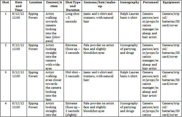
The performance part of the video will be filmed in the forest, when I say performance based I mean when our artist will be singing into the camera, We thought that the forest would be the appropriate place to film because its a natural place and contradicts the idea of the song, but at the same time it does relate to the lyrics, we also thought the forest has a quirky feel to it. It will be easy for us to film in the forest as it is such a wide open space and gives us plenty of room to try out differnt shots. An issue that may occur is if it was to rain then it will effect the whole image of that scene. We will have to make sure that we come prepared for this, e.g. bring spare clothing and covers so that the equipment doesnt get damaged.
 
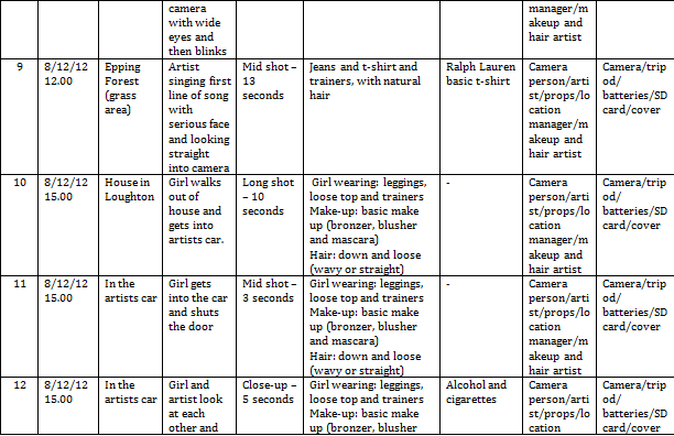
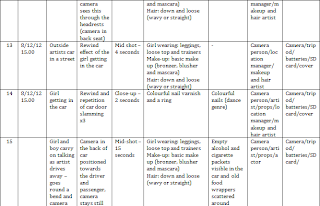
We will be filming inside a car, in the front seat will be the artist and a girl, they will be talking to each other as he drives, they arrive at an off license and the girl comes out to the car with alcohol and cigarettes, they then both drive to the party they are attending. In order to make this look as real as possible we will add empty alcohol bottles in the car and cigarette packets, to give off the impression that the pair have been drinking and are having a wild time, and to also connote the idea of their generation being messed up. We will make sure that when we film this it wont be dangerous as we have to consider the driver, as he has to concentrate on the roads.
 
Another location where we will be filming is the inside of a house, this is where the party will be taking place. The house allows us to film a variety of different shots, we can also adjust the lighting in the house to what we need it to be. We can easily create a party atmosphere in the house as well, so that we can make it look as life like as possible. Once we have set up the scene we will have people dancing around and jumping to create the perfect party scene, they're will be alcohol involved and cigarettes, also references to drugs, so show the generation is messed up.
 
Lastly is the garden, this is where some of the party scenes will also be filmed also. These scenes will be filmed when it is naturally dark outside, we will get our light from the decking in the garden, there are lights placed in the decking, this will give it a club edge. We will use sparklers and create effects on that when we edit.
 
Below is an screenshot from my music video, in which we originally planned to do, we decided to follow through with it as it meets conventions of dance music videos. The below screenshot is when the artist 'Mike smith' and the girl are on their journey to a party.
Above is a print screen shot from my music video of when, I filmed outside of a house, as this helped the narrative of my music video, and I had originally planned to do it, so I followed through with it.
 
Above is a screen shot from my music video, of one of my locations being a garden. The garden was used mainly for the concept part of my music video, as it was a simple setting.
 
Above is a print screen shot from my music video, this is the forest where the performance part of my music video was taken, this is where I challenged the typical codes and conventions of dance music videos.


Diversity of music videos

Michael Gondry and Chris Cunningham are both directors who make diverse types of music videos, these are types that usually go against the conventions that we expect to see in a stereotypical music video. Reason being for them doing this is so that their music videos look different to the rest that are out there in the industry, their videos stand out as after the audience watch it they remember it and then its promoted well and it stands out compared to the rest.

The first music video I'm going to analyse is 'Come into my world' by Kylie Minogue, this song was directed by Michael Gondry.

To start off with Kylie Minogue is a conventional artist of pop, she meets every convention to do with the genre pop, we see this through the whole of the song. Kylies appearence helps meet the conventions of a pop star. However this particular music video of her doesnt meet the conventions of a pop artists music video, the audience can see this through her appearence, particularly by what she is wearing and how the music video is set out and what it contains. Typical pop music video's have there typical conventions, they include being fun. They are usually soft and there just to enjoy, a lot of close ups are used so that the audience recognise the artist. There are plenty of other pop artists who follow the main conventions that I mentioned earlier are; Lady Gaga and Britney Spears.  We see the conventions shown in Lady Gaga's Pokerface, where we see lots of close ups, not only this but also, its based around a party, its a feel good song that meets the conventions and attracts the audience. However in Kylie Minogues song, the main conventions arent shown, throughout Come into my world, Kylie is filmed walking around in the same long shot frame and this is repeated, leaving the audience feeling very bored. The location that has been chosen isnt a main convention that we see in pop music videos, usually pop videos are based around a party where as Kylie is based in a quiet street and is just walking around it is dull and boring. It doesnt give off a positive vibe, as in he background as the audience we see different scenarios one of them is a couple who are arguing and also another female is throwing a males clothes out of the window from the top floor. The lyrics could very much relate to the visuals, maybe Kylie is trying to describe an event in her life and that she is arguing with a romance that she has or has had in the past and letting the audienc know that her life is tough. I believe that Kylie Minogue is trying to show in her video that she is just an ordinary person, this is shown through when she is carrying around her dry cleaning around town.

I believe that Goodwins theory is shown through this particular music video, I think that it includes specifically intertextual references and relationship between the lyrics. The relationship between the lyrics and the visuals is shown when Kylie sings the lyrics 'Come into my world', this is about a male coming into her life and having a romance, she wants someone to come and change her life, this is shown by the visuals, as her daily routine is edited and repeated throughout the video, it shows that shes saying her life is the same day in and day out and its getting boring for her she wants a male to come into her life and change that part for her. Intertexual reference is also shown as Kylie portraying herself to be whats known as a 'normal' girl, and that she has a life like everyone else and still has to do the same things as others, for example when she picks up her dry cleaning. 

I believe that the style of the music video are performance and concept based. We see the performance part of the video where Kylie sings into the camera, she starts to become normal around the camera whilst perfoming as the normal girl she is portraying walking around doing her chores. This is emphasised as the music video repeats Kylie completing daily tasks, its filmed in the way so that it looks as if she has a lot to do, but she copes well in it and wants someone else to 'come into her world' and help her out a bit, everythings going well for her but she just wants someone else there to share and embrace it with her.

In this music video Kylie is seen as a differnent artists and is represented in a completely different way in which we are usually used too. I think that the director has made Kylie act like this, in this music video on purpose so that it creates a clear contrast and it emphasises the fact that in this music video Kylie is boring, as in all of her other music videos she is fun and bubbly. However I do also think that Kylie wanted to try and do something different but, then realised this wasnt for her and isnt what she is an artist.

The second music video I'm going to analyse is 'Frozen' by Madonna, this song was directed by Chris Cunningham.

Madonna is a pop artist, as I said earlier the main conventions of a pop artist is to have a fun personality and to be bubbly, and to show this through their music videos and a lot of close ups of the artist being used. The audience who listen to pop artists are usually teenagers, so directors need to make sure that they are creating music videos that teenagers are going to watch and be interested. The locations that are usually used in pop artists music videos are party scenes at houses, in a club or on a beach e.g fun locations. I believe that in order for the record to sell and the target audience to enjoy the music video, they need to include scenes in which relate to teenagers. I think artists that do this well are Britney Spears and Justin Bieber. Unlike the artists I've just mentioned Madonna doesnt follow the conventions of a pop video. For this particular song Madonna chose to go against the conventions, we see this as the lighting is all dark she is dressed in a long black dress with extra long bits flowing in the wind, the song also has a sinister feel to it. The video connotes the idea of a gothic song, it gives off the vibe of being depressing. There is no relationship between the lyrics and the visuals, compared to what Madonna usually does this is the complete oppsosite and is challenging.
I do believe that it meets the conventions of a pop music video as it uses loads of close ups of her face and her body parts. However the close ups in this particular video portray Madonna as being evil and witch like.

I believe that Goodwins theory is shown in this video, some of the video has relationship between the visuals and the music and also the close ups are used.

I can see that the relationship between the music and the visuals are shown throughout the song, this is shown when Madonna is wearing a black cape and it is blowing around everywhere this goes well with the music as as the cape is blowing the pace picks up and the song becomes faster. Various close ups are also used when there is first of all a long shot shown and then, more Madonnas are edited in and a close up of hre face is shown, as she sings 'give yourself to me'. I do believe that Madonna wanted to create this music video to show that she is different, and that although her previous music videos are what people think and expect of her, she is showing her dark side, maybe she is trying to portray what she is really like.

The style of this music video is performance based, this is confirmed as Madonna is singing into the camera, you can tell that she is performing to it as she is aware that its there. Concept is also shown in the video as animals are used, dogs and birds, therefore these may represent something in the video. By Madonna going for a performance based video it allows her to show her true emotions and feelings compared to her usual music videos, I think she takes advantage of it here as the song is very deep and has a quirky vibe to it.

It is clear that Madonna has represented herself in a different way to what she usually does. However in a way she can get away with it as she is an artist that has a strong fan base and following, her taking this risk doesnt change a lot for her, as she still has her followers. Her appearence is completely different to what we usually see in this video she is dressed in black, her face is very pale and has been made to look like an evil and sinister character.

I believe that for the dance genre, in which I have chosen to make a music video around, I may be able to use part of Gondry and Cunninghams techniques.


Planning artists image

We have to decide what clothing our artist Mike Smith will wear when we film for our music video, this is a vital part when deciding, because we have to make sure that we meet the conventions of a dance music video through our artists appearance. We have to create the right character, and make him relate to the audience that is watching. Throughout the music video the artist will keep the same outfit on, we decided to keep him looking simple, he will wear plain dark jeans, a designer top, trainers and a hoodie. Mike Smith will also be wearing geek glasses, to give that edgy cool look.  Its beneficial if we have our artist dressed relaxed, due to him appearing normal, therefore he will relate to the audience as he wont come across as being a flash celebrity. When the camera is not just on our artist Mike Smith there will be other characters in the shot, e.g. teenagers at a party, they will to be dressed in casual clothes. This creates a good relationship between the audience and the artist as other people are dressed casually just like him so he blends in therefore it makes him appear just as normal as everyone else.
.After completing some research we found that most dance music artists wear plain clothing and keep it simple. Below is the type of look our artist is going for:


Below is a screen shot from my music video, of what the outcome of my artists image finally looked like, I followed exactly as I said I would.


Above is a screen shot from my music video of my artist wearing the geek glasses that I set out for him to wear originally.

I didn't originally plan this but the above screen shot, is of the jacket that my artist was wearing which has the letter 'M' on it and his name is Mike Smith.